When a Matching Set Reads Expensive — and When It Reads Cheap
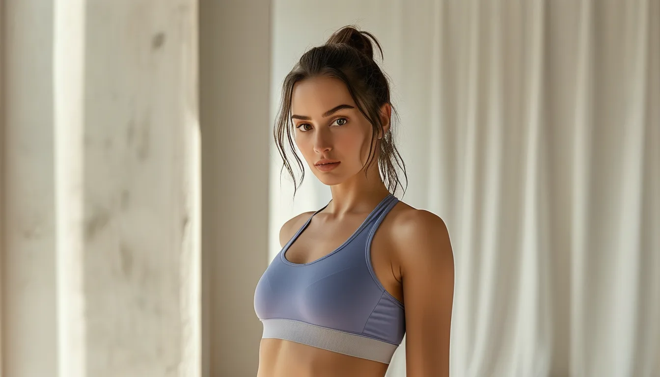
Quick Answer: A matching set reads expensive when the two pieces share exact dye lot and fabric weight, the waistband sits without digging, seams are flatlocked rather than overlocked, and the fabric is opaque under stretch. It reads cheap when the top and bottom are subtly different shades, the fabric thins at the seat, or the set is over-branded.
The whole appeal of a matching set is that it does the coordinating for you.
Which makes it especially irritating when the finished effect is less pulled-together than the mismatched leggings and tee you already owned.
The gap between a set that looks like an outfit and one that looks like a two-piece uniform comes down to a handful of specifics — and most of them are visible before you take the tags off.
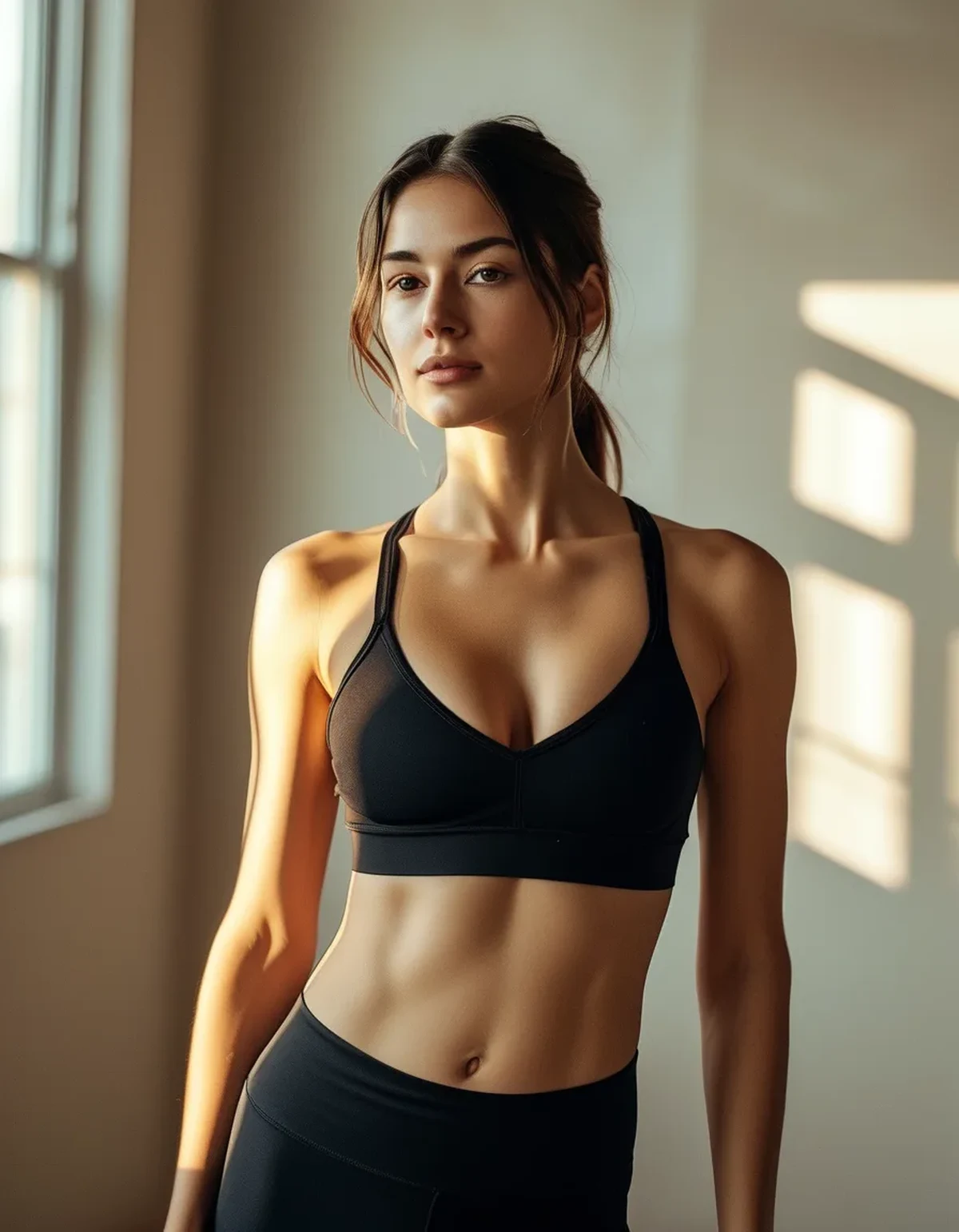
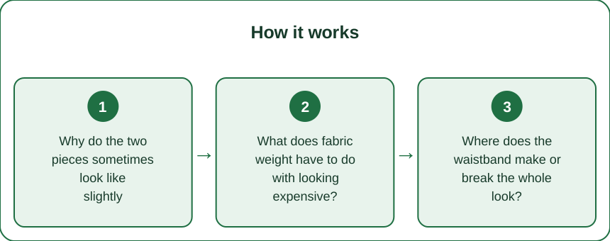
Why do the two pieces sometimes look like slightly different colors?
Because they often are, and it is the single most common tell.
Tops and bottoms are frequently cut from different fabric rolls, sometimes dyed in different batches, and even a small dye lot variance is glaringly visible when two garments sit adjacent on one body. Grey and dusty pastels show it worst. True black and bright saturated colors hide it best.
How to check before buying:
- Hold the pieces together under natural light, not store fluorescents, which flatten subtle variance.
- Look at the fabric where it folds — shadowed areas exaggerate any mismatch.
- Check the fiber content labels on both. If the top is 88/12 nylon-spandex and the leggings are 75/25 polyester-spandex, they will take light differently even at identical dye, and the set will never read as one piece.
Sets sold as a single SKU are usually safer than sets assembled from separately stocked pieces, because the manufacturer cut them together.
What does fabric weight have to do with looking expensive?
More than color, honestly.
Matched weight is what makes a set read as one garment. A substantial legging paired with a flimsy crop top looks like two things that happened to be the same color. A light top with a light bottom can look excellent — the failure mode is mismatch, not lightness.
Specific things to feel for:
- Opacity under stretch. Pull the fabric across your hand. If your skin shows clearly, it will show in a squat. This is the fastest quality test there is.
- Recovery. Stretch the waistband and release. Good fabric snaps back instantly. Mediocre fabric hesitates, which is what causes the sagging seat after two wears.
- Surface finish. A slightly matte, dense face reads as more expensive than a shiny one, which shows every wrinkle and cellulite shadow under direct light.
Weight ranges that tend to work: roughly 240–290 gsm for leggings, 180–230 gsm for the top. You will not always find those numbers listed, but hand-feel correlates closely once you have compared a few.
Where does the waistband make or break the whole look?
At the top edge, always.
A waistband that digs creates a visible ridge through a fitted top, and no amount of quality elsewhere overcomes it. Wide bands distribute pressure and disappear; narrow elastic bands concentrate it and announce themselves.
Look for:
- A band of at least 3 to 4 inches on high-rise styles.
- No exposed elastic edge on the inside — a bound or covered edge is a genuine construction upgrade and costs the manufacturer real money.
- A gusset in the leggings. Its presence signals a pattern designed for movement rather than a rectangle sewn into a tube, and it prevents the front seam issues that ruin fitted looks.
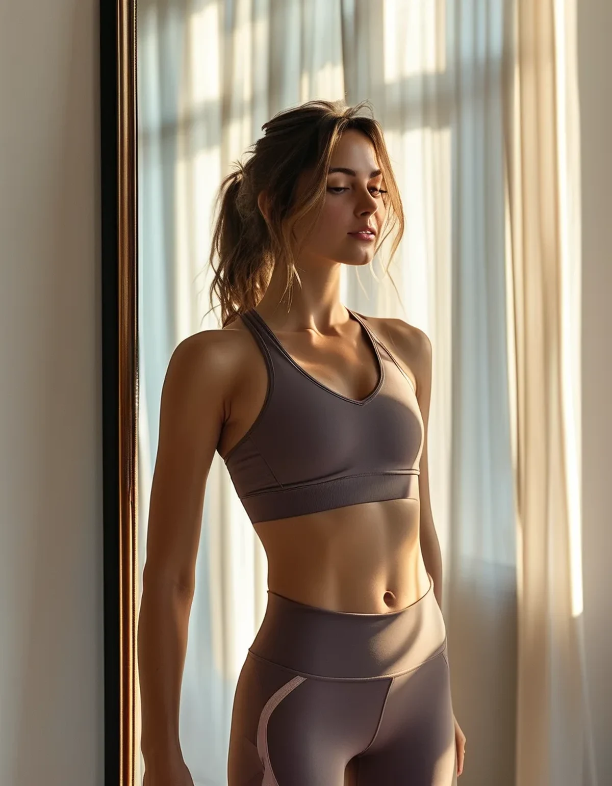
Then there is the interaction between the two pieces. If the top’s hem lands exactly at the waistband seam, every shift creates a visible line. Either overlap it by two inches or leave a deliberate gap. Landing exactly on it is the worst of both.
Myth vs Fact: Matching Set Edition
Myth: Matching sets always look more expensive than separates. Fact: A well-matched set does. A poorly matched one draws the eye directly to the mismatch, which separates never would.
Myth: You should size the top and bottom the same. Fact: Size each to fit. Most people carry different proportions top and bottom, and a set that fits both is worth more than a set with consistent tags. Buy separates within the same line if the brand allows it.
Myth: Neutral sets are the safest choice. Fact: Neutrals are the least forgiving of dye lot variance — greys, taupes, and soft beiges expose mismatch fastest. Saturated colors and true black hide it.
Myth: A visible logo signals quality. Fact: Logo placement on both pieces is the most reliable way to make a set read as cheap. One small mark, or none, always looks more expensive.
Myth: Ribbed sets are more flattering. Fact: Ribbing stretches unevenly and can widen visually at the hip and bust. It looks excellent on the hanger and behaves unpredictably on bodies, which is why it is the most-returned texture in the category.
How do you make a set you already own look better?
Three adjustments that cost nothing:
Break the block. A set is a solid column of one color, which can read as a uniform. Adding one contrasting element — an open overshirt, a different-toned jacket, a visible sock, contrasting shoes — turns it into an outfit. This is the single fastest upgrade.
Adjust the hem relationship. If the top hits the waistband seam, tuck a corner, add two inches of overlap, or choose a shorter top and let the waistband show fully as a deliberate band.
Wash them together, always. Once they diverge in wash cycles they diverge in color and pilling, and a set that started matched drifts apart within a season. Cold water, inside out, no fabric softener — softener coats elastane and destroys recovery, which is what makes a set look tired.
If the set is already mismatched in color, stop fighting it. Wear the pieces as separates with other things and let them be two good garments rather than one failed outfit. The frustrating ones are usually still perfectly good clothes in a different configuration.
FAQ: Matching Set Questions, Answered
Is it worth buying the top and bottom in different sizes?
Yes, whenever the brand sells them separately. Fit beats matching tags every time, and a set that pulls across the bust or gaps at the waist undoes everything else.
How many matching sets are actually useful?
Most people wear two or three heavily and let the rest sit. Two versatile ones in colors you actually reach for outperform six in the abstract, and the storage math gets ugly fast past four.
Do sets work outside of workouts?
Increasingly, yes — but the details that make that work are fabric weight and the absence of logos. A matte, substantial set in a neutral reads as loungewear or travel wear. A shiny, branded one reads only as gym clothes regardless of styling.
TL;DR:
- Check dye lot by holding both pieces together in natural light before buying.
- Matched fabric weight is what makes a set read as one garment.
- A wide, covered-edge waistband and a gusset are the construction details worth paying for.
- Break the color block with one contrasting layer to turn a set into an outfit.
- Wash the two pieces together, cold and inside out, or they drift apart within a season.
None of this requires spending more. Most of it is checking two labels and looking at the pieces under a window instead of under store lighting, which takes about forty seconds and saves a return.
See It in Motion
Seen here: High Waist 8” Yoga Shorts — shop similar styles on bubblelime.com
Keep Reading
This article is for general informational and styling purposes only. Fit, sizing, and product availability may vary.