Why Matching Activewear Sets Photograph Noticeably Better Than Mixed-and-Matched Outfits
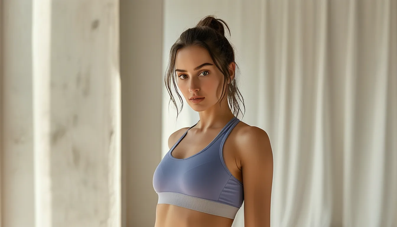
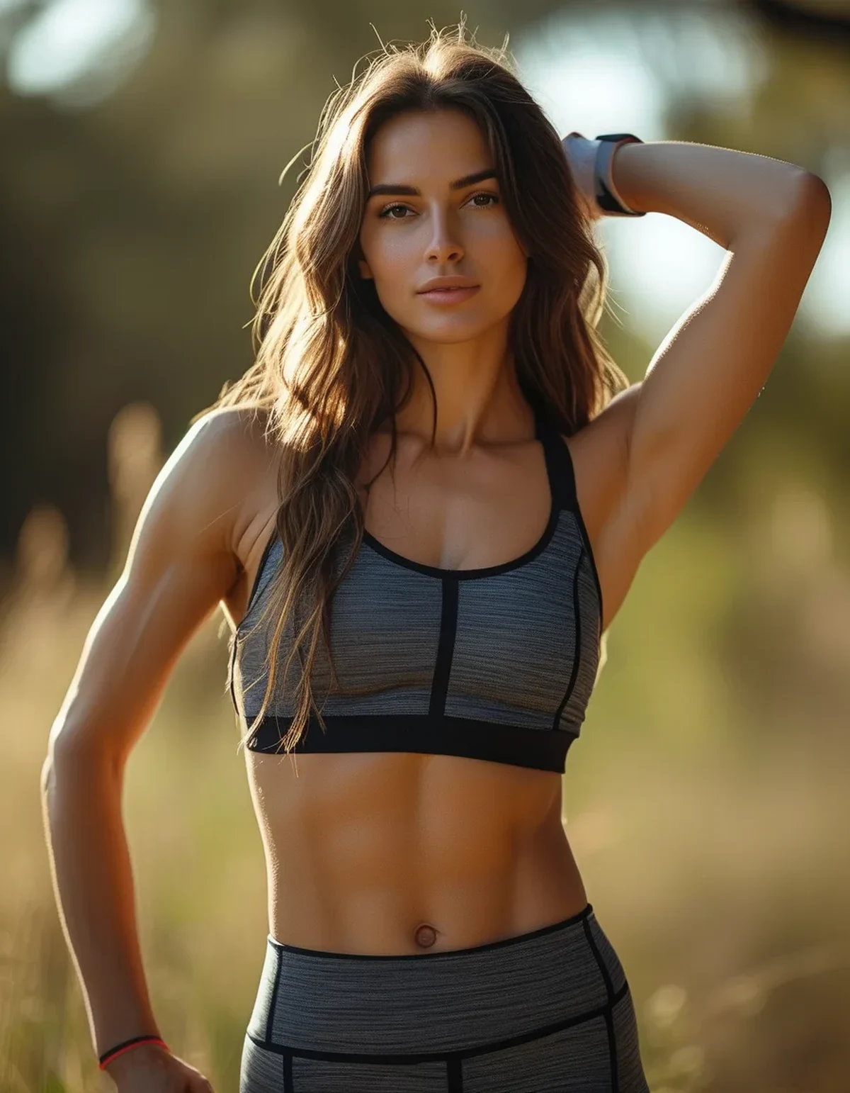
Quick Answer: A matching set creates one continuous color block from shoulders to ankles, which photographs as a single clean visual line, while a mixed outfit introduces a color break at the waist that visually cuts the body in two — the continuous line isn’t just a style choice, it’s a genuine visual mechanism that makes a matching set look more put-together in photos even when the individual pieces are equally nice.
You’ve noticed matching sets just look better in photos than your favorite mixed-and-matched outfit, even when you can’t quite explain why. The reason is a real visual effect, not just trend-following.
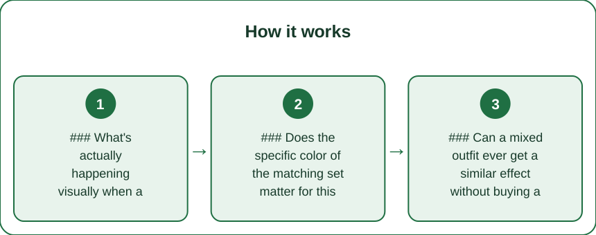
### What’s actually happening visually when a color break hits at the waist?
A color change at the waistline creates a horizontal visual divider that splits the body into two separate blocks, which the eye reads as shorter and less unified than one continuous line running the full length of the body. This is a well-established principle in visual proportion, not specific to activewear — it’s the same reason monochrome outfits are often recommended for a leaner, longer silhouette in general styling advice.
A matching set simply removes that dividing line by default, which is why it reads as more polished without requiring any additional styling effort.
### Does the specific color of the matching set matter for this effect?
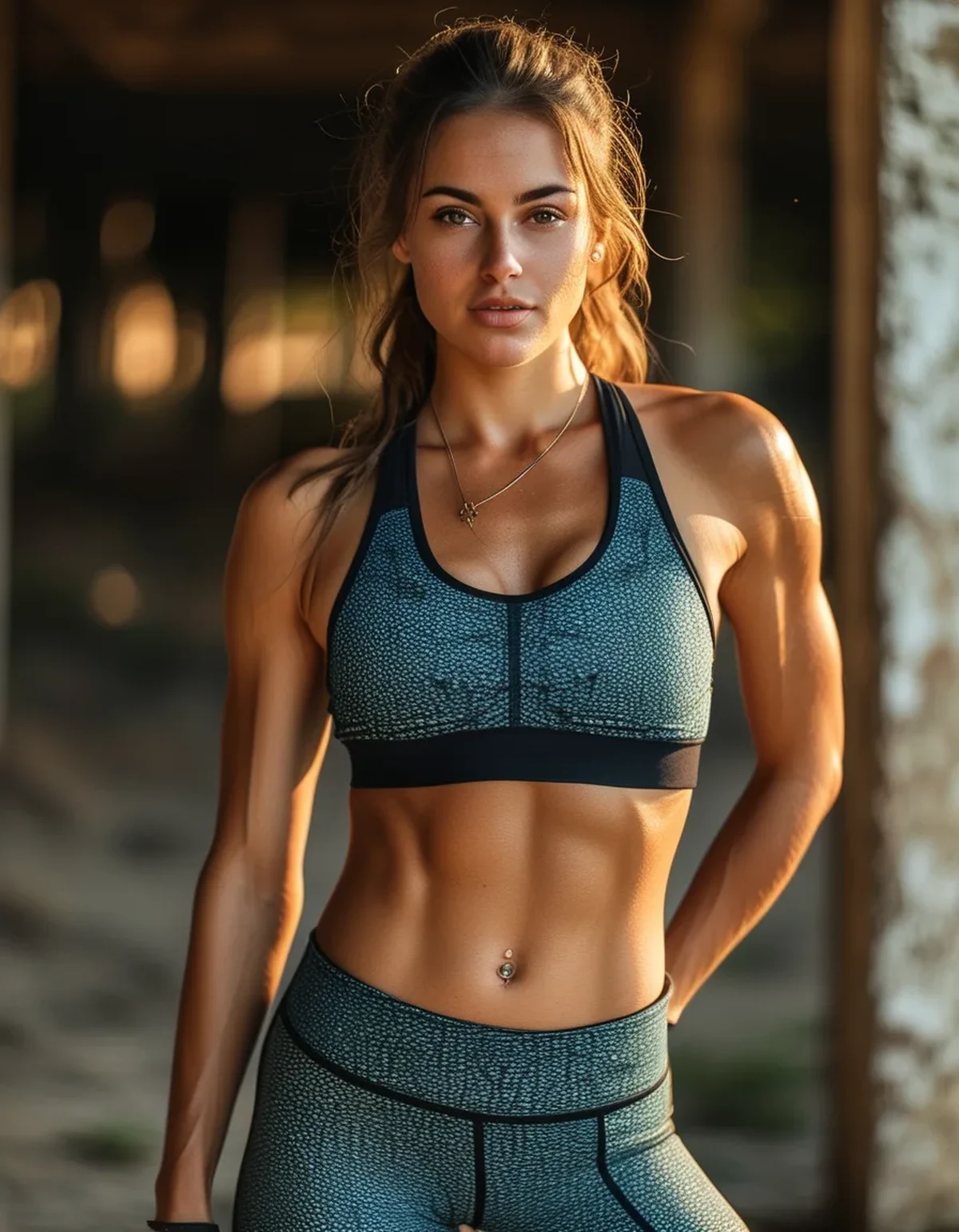
The effect works with any color, but darker and more saturated colors tend to show it most clearly in photos, since they create the strongest, most visually continuous block. Lighter or pastel matching sets still get the same continuous-line benefit, just with a slightly softer visual effect than a bold matching color would produce.
This is useful to know if the goal is specifically photo impact — a bold matching color tends to read more dramatically in photos than a subtle, muted matching set does.
### Can a mixed outfit ever get a similar effect without buying a full matching set?
Yes — choosing a top and bottom in very close, though not identical, shades of the same color family gets much of the same visual continuity benefit, without needing an exact matching set. This is a useful workaround for building outfits from separates already owned, rather than requiring every look to be a purchased set.
The key is minimizing contrast at the waistline specifically — even non-identical pieces in a similar tonal range noticeably reduce the visual break compared to two contrasting colors.
### Is there a downside to always wearing matching sets for photos?
The main tradeoff is variety — an entire wardrobe of only matching sets can start to feel repetitive in photos over time, compared to a mix of matching sets and well-coordinated separates. Using matching sets strategically for specific photos or occasions, rather than exclusively, tends to keep a content feed or personal photo collection feeling more varied while still using the technique when it matters most.
This is more a content-variety consideration than a styling flaw — the visual effect itself remains reliable every time a genuine matching set is worn.
### FAQ: Matching Sets and Photos, Answered
Do matching sets work for every body type the same way?
The continuous-line effect applies broadly across body types, though the overall silhouette impact can be fine-tuned further with fit choices like a higher rise or more fitted versus relaxed cut.
Should I avoid patterns if I want this photo effect?
A busy pattern across a full matching set can work, but a solid color or subtle matching pattern tends to preserve the clean-line effect more reliably than a bold, high-contrast pattern.
Is a matching set always better than a well-coordinated separate outfit?
Not always — a well-chosen separate outfit in closely matched tones can achieve a similar effect; a true matching set just makes that outcome the default without extra coordination effort.
TL;DR:
- A matching set avoids the horizontal color break at the waist that visually shortens a mixed outfit in photos
- Darker, more saturated matching colors show the continuous-line effect most clearly
- Close-toned (not identical) separates can approximate much of the same visual benefit
- Using matching sets strategically, not exclusively, keeps a photo feed feeling varied while still using the technique
The better photo result isn’t imagined or trend-driven — it’s a real visual proportion effect, which means it’s also a technique that can be borrowed even without buying an entirely new matching set.
Keep Reading
This article is for general informational and styling purposes only. Fit, sizing, and product availability may vary.